Karanji: Crafting a Cultural Brand Identity
Category:
E-Commerce
Client:
Karanji Clothing
Designed and developed a brand identity and visual language for a modern Indian clothing label
My Role
Interaction Designer
Duration
6 Weeks
Tools
Shopify, Figma, Canva
01
OVERVIEW
tldr;
Developed comprehensive brand identity and Shopify website for Karanji, a culturally-rooted modern Indian clothing label. Delivered visual system, logo design, and user-focused e-commerce platform reflecting the brand's narrative-driven approach.
02
LOGO

The client wanted a name that felt personal, rooted in tradition, and emotionally resonant. “Karanji” was chosen because it holds cultural significance across India. It’s known as Gujiya, Ghooghra, Kajjikayalu, Karjikayi, and Sweet Somas in different regions, making it both familiar and meaningful.
The name Karanji serves as both a cultural symbol and a personal touchpoint. It reinforces the brand’s values of thoughtful creation, comfort, and connection, as the client intended.
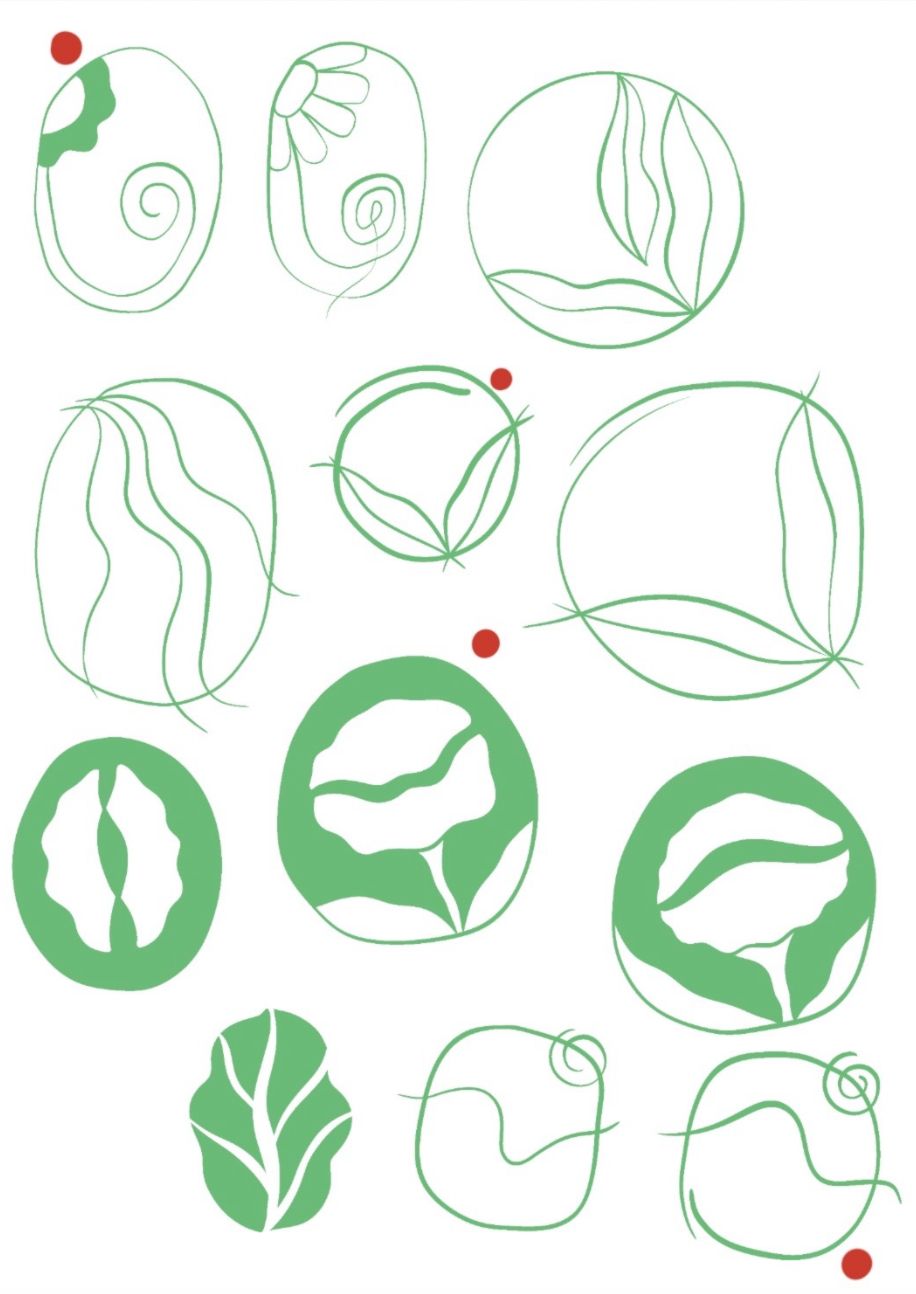
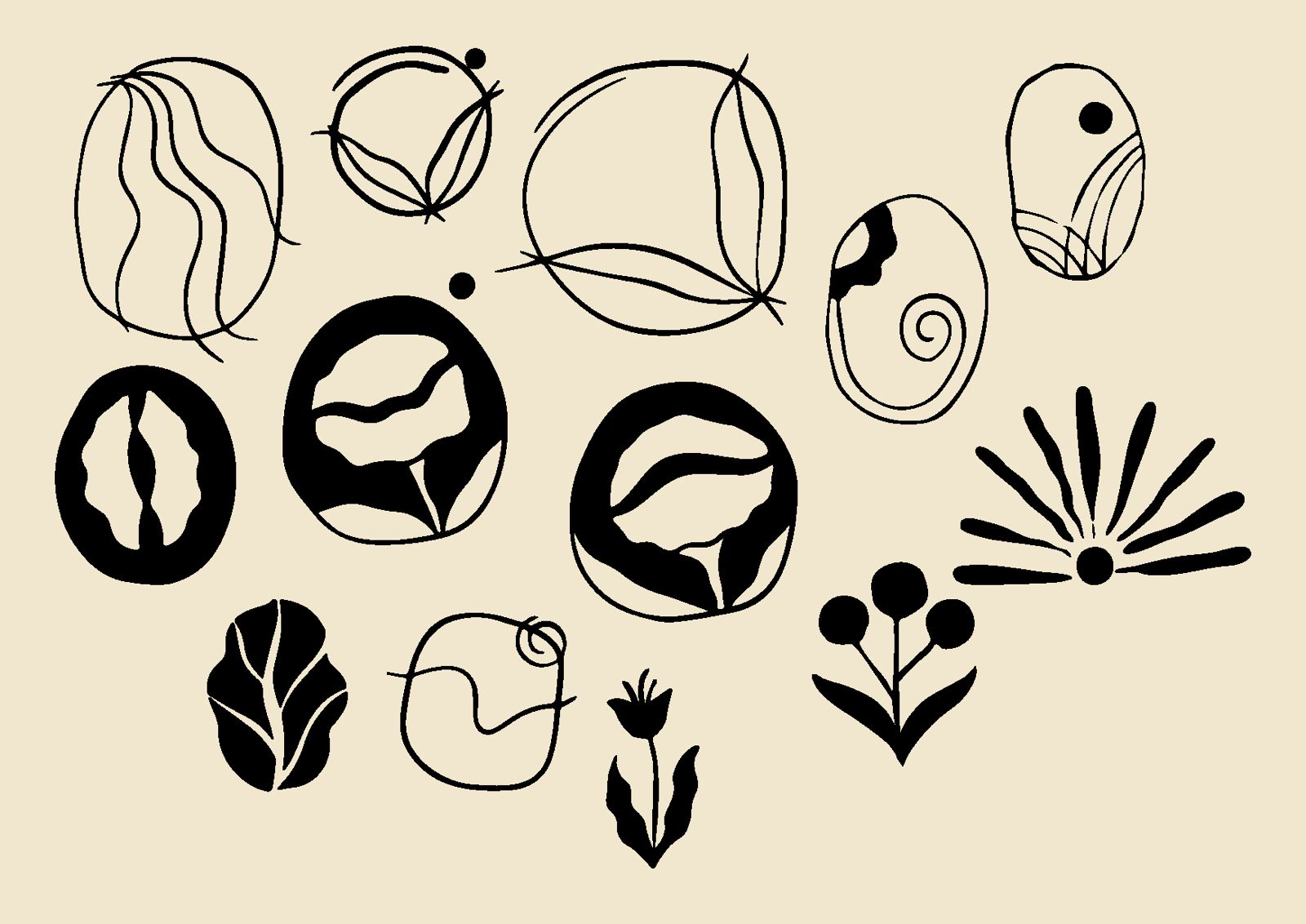
The client requested a logo that felt soft, grounded in heritage, and suited for modern lifestyles. It needed to visually convey ease, craft, and quiet elegance.
I took inspiration from the form of the Karanji sweet itself. Its crescent shape and delicate folds became the foundation for the visual identity. I translated those organic curves into the logomark, creating a shape that subtly references both the sweet and the layers of handcrafted garments.
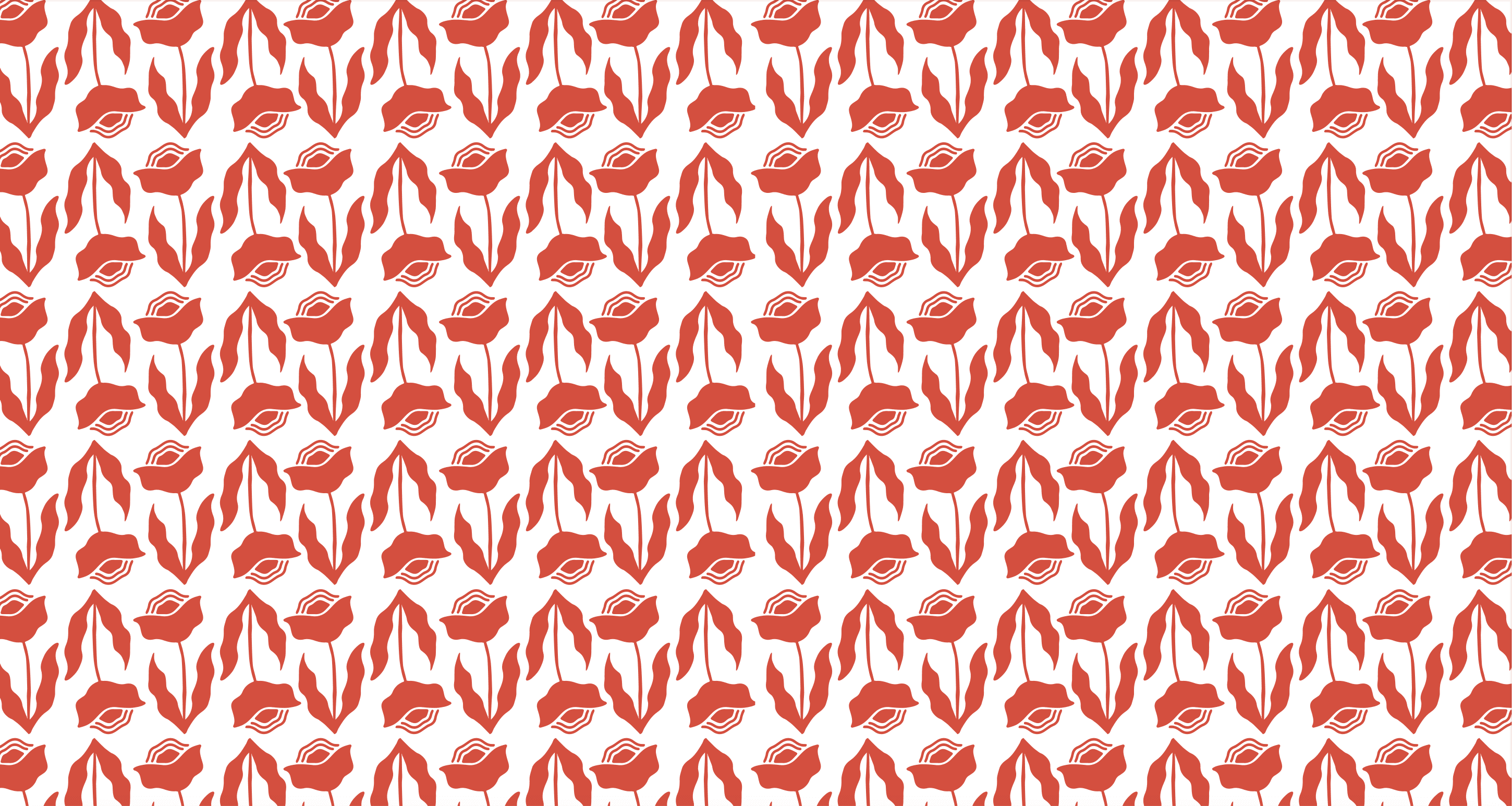
To balance tradition with modernity, I paired this form with clean, rounded typography. The result is a logo that feels warm, minimal, and intentional—capturing the essence of a brand that honors tradition while staying relevant to contemporary life.
03
TYPOGRAPHY
Mont
-medium
Secondary
Typeface
A
a
Mont - Medium
Aa Bb Cc Dd Ee Ff Gg Hh Ii Jj Kk Ll Mm Nn Oo Pp Qq Rr Ss Tt Uu Vv Ww Xx Yy Zz
Filson Pro
A
a
-medium
Secondary
Typeface
Filson Pro - Medium
Aa Bb Cc Dd Ee Ff Gg Hh Ii Jj Kk Ll Mm Nn Oo Pp Qq Rr Ss Tt Uu Vv Ww Xx Yy Zz
04
COLOURS
Brand Palette

05
REFLECTIONS
Brand identity is storytelling
Every design decision, from the logo's crescent curve to the typography pairing, needed to tell the same story of cultural warmth meeting modern sophistication.
Constraints breed creativity
Working within Shopify's platform limitations pushed more creative solutions for layout, interaction, and brand expression within existing templates.
Cultural sensitivity requires research